04 — The Landing Page
Sixteen KPIs. Three lenses.
One scoreboard the exec can read in a minute.
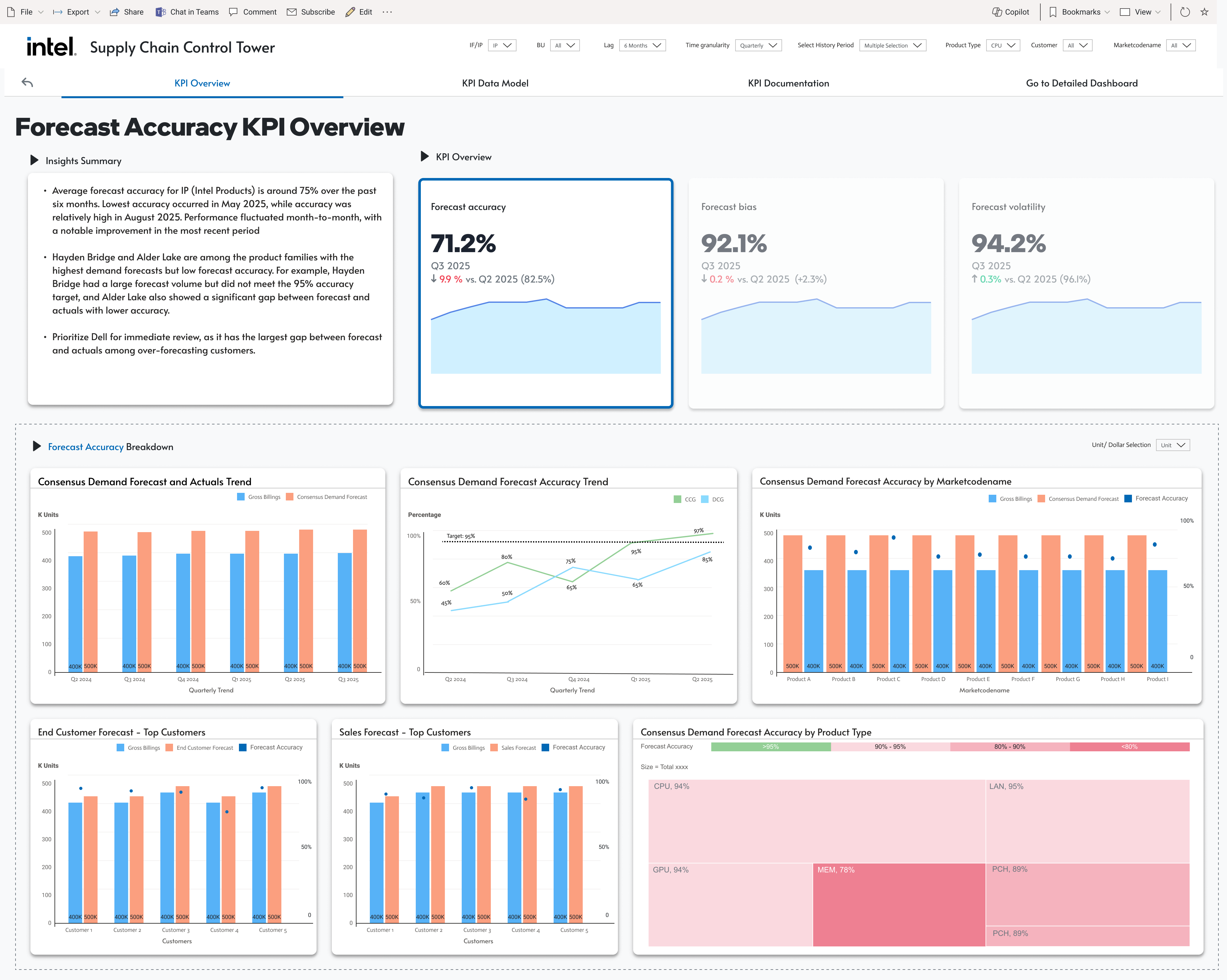
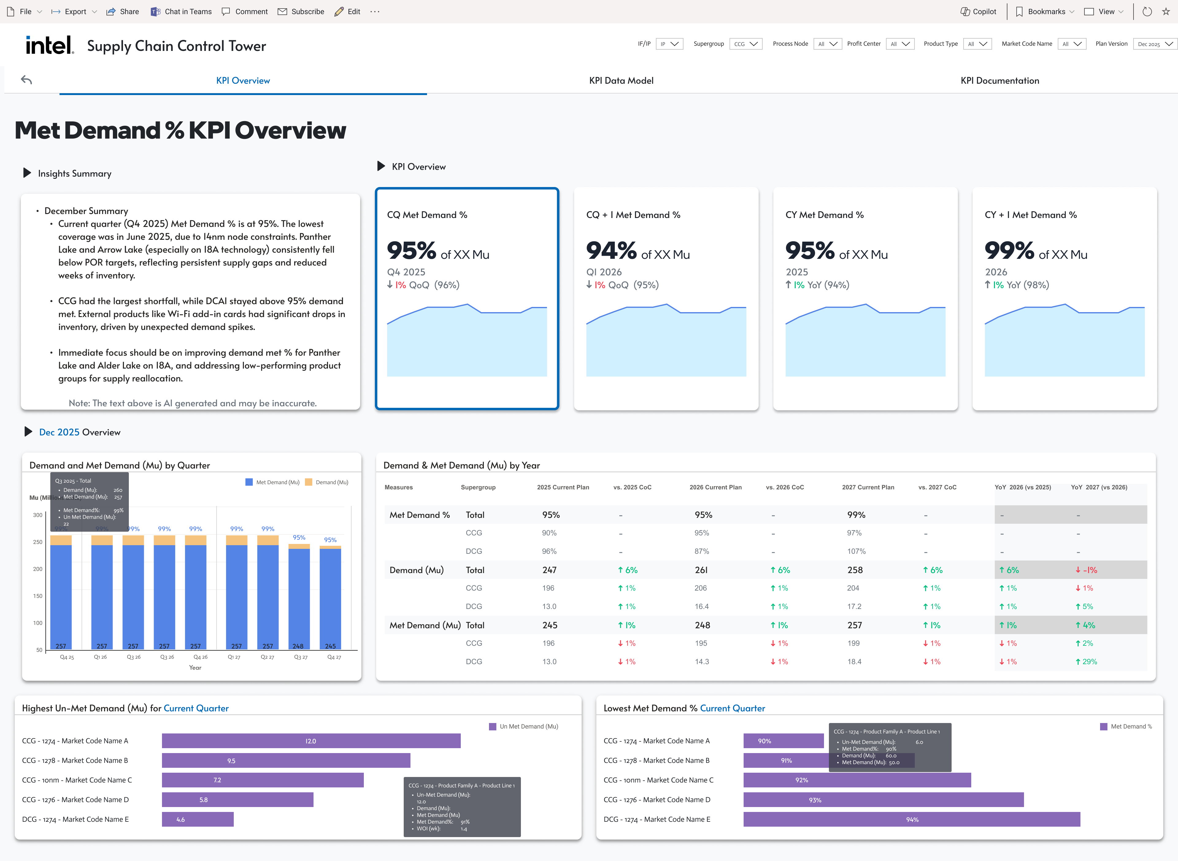
Revenue Growth
Forecast Accuracy · Met Demand % · Order Fill Rate · On-Time Delivery · Total Revenue · Expedite %
Operating Margin
Operating Margin · Supply Adherence % · Gross Margin % · Lead Time Variability · Strategic Objectives · Time-to-Market vs Commitment
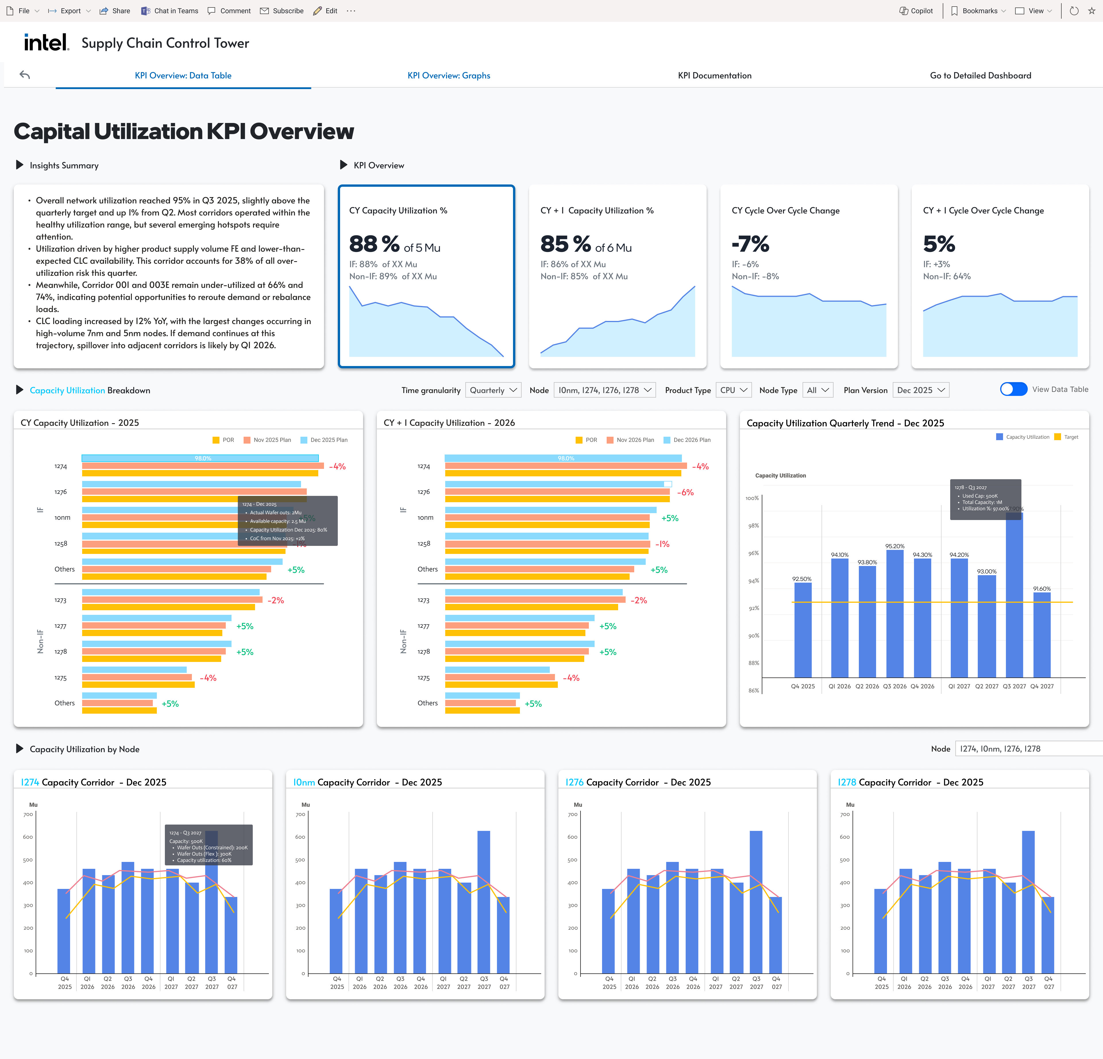
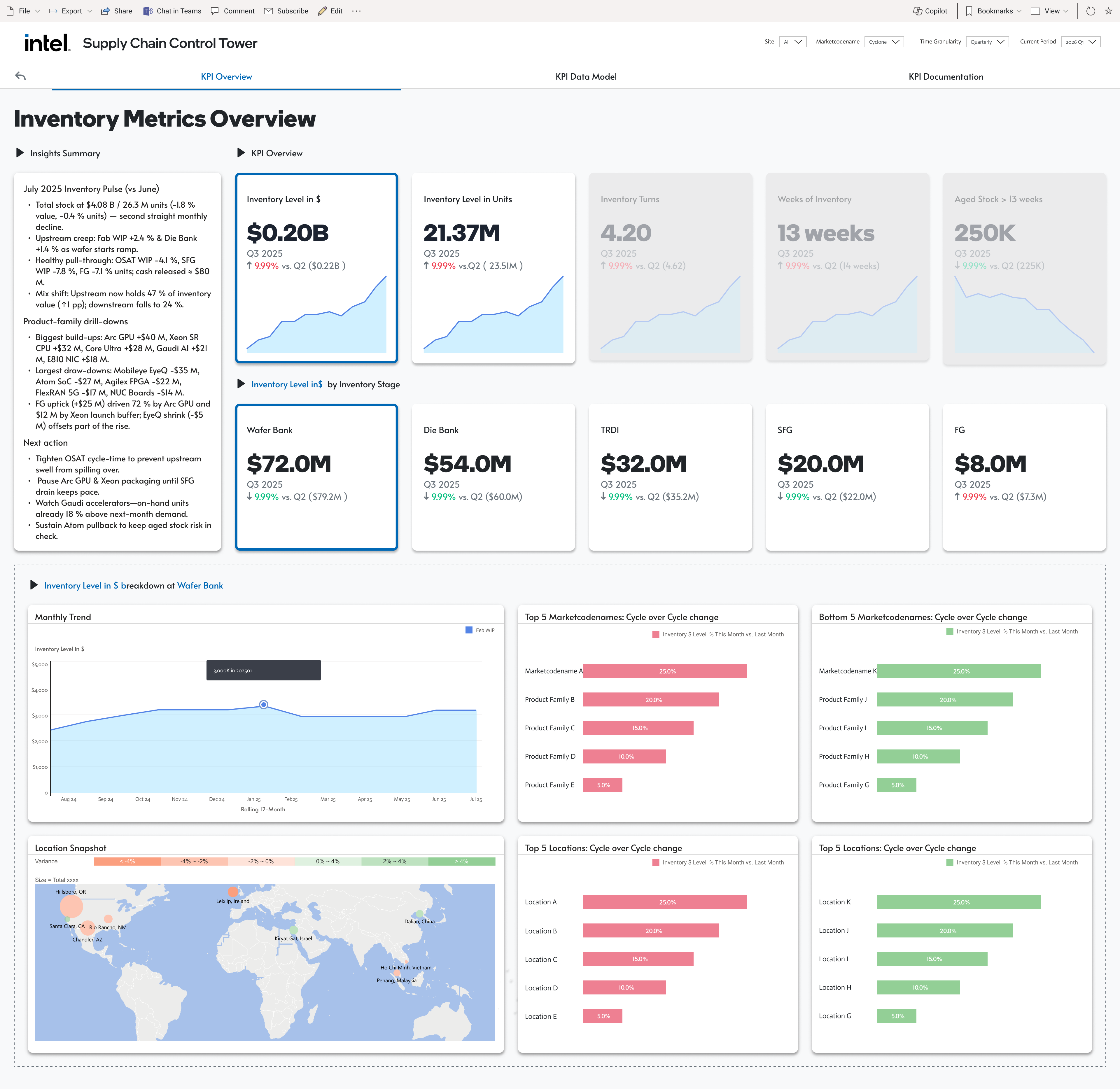
Asset Efficiency
Inventory Level ($) · Capacity Utilization % · Supplier OTP · Cycle Time
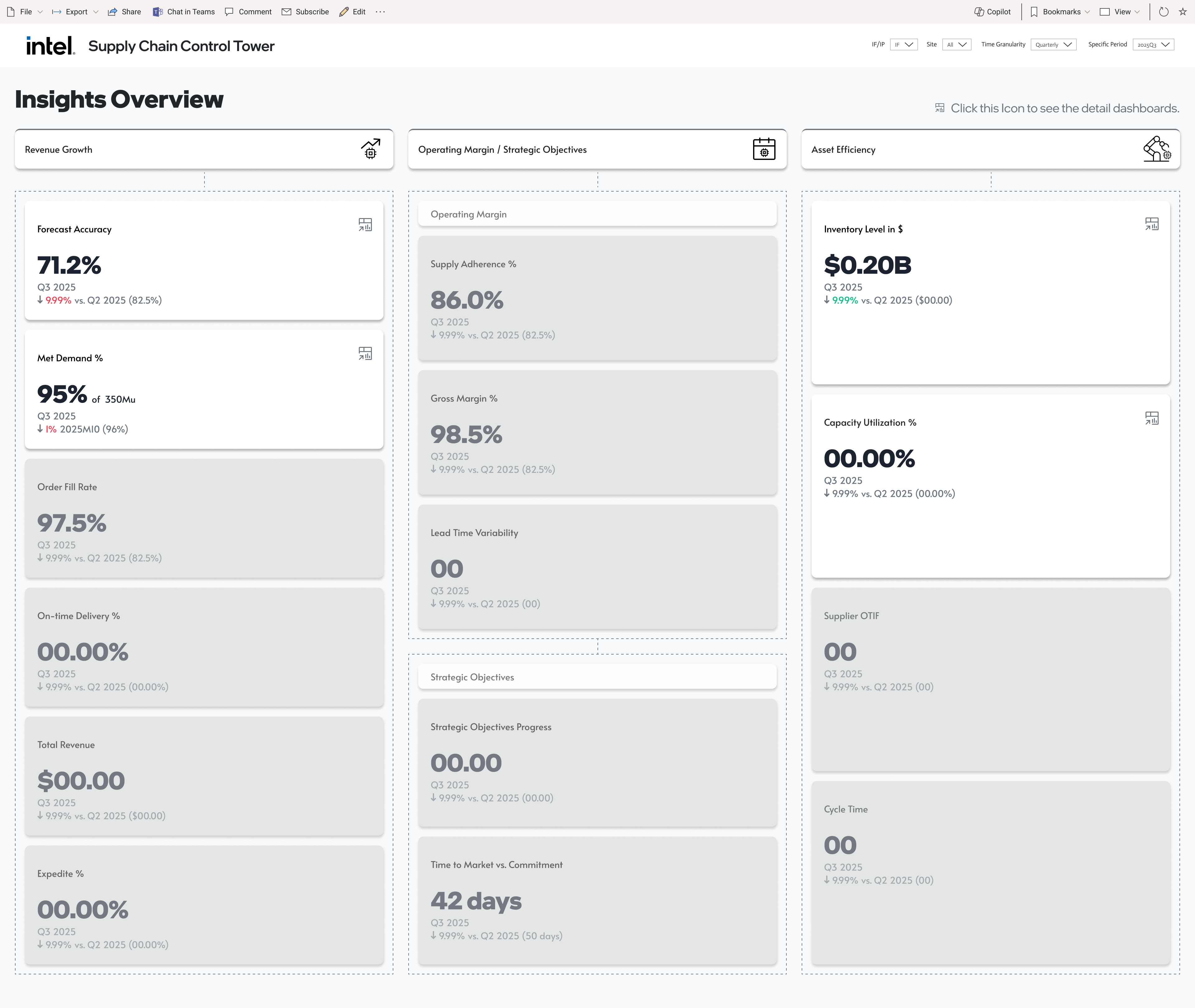
Insights Overview — click any KPI tile to drill into its dedicated overview.